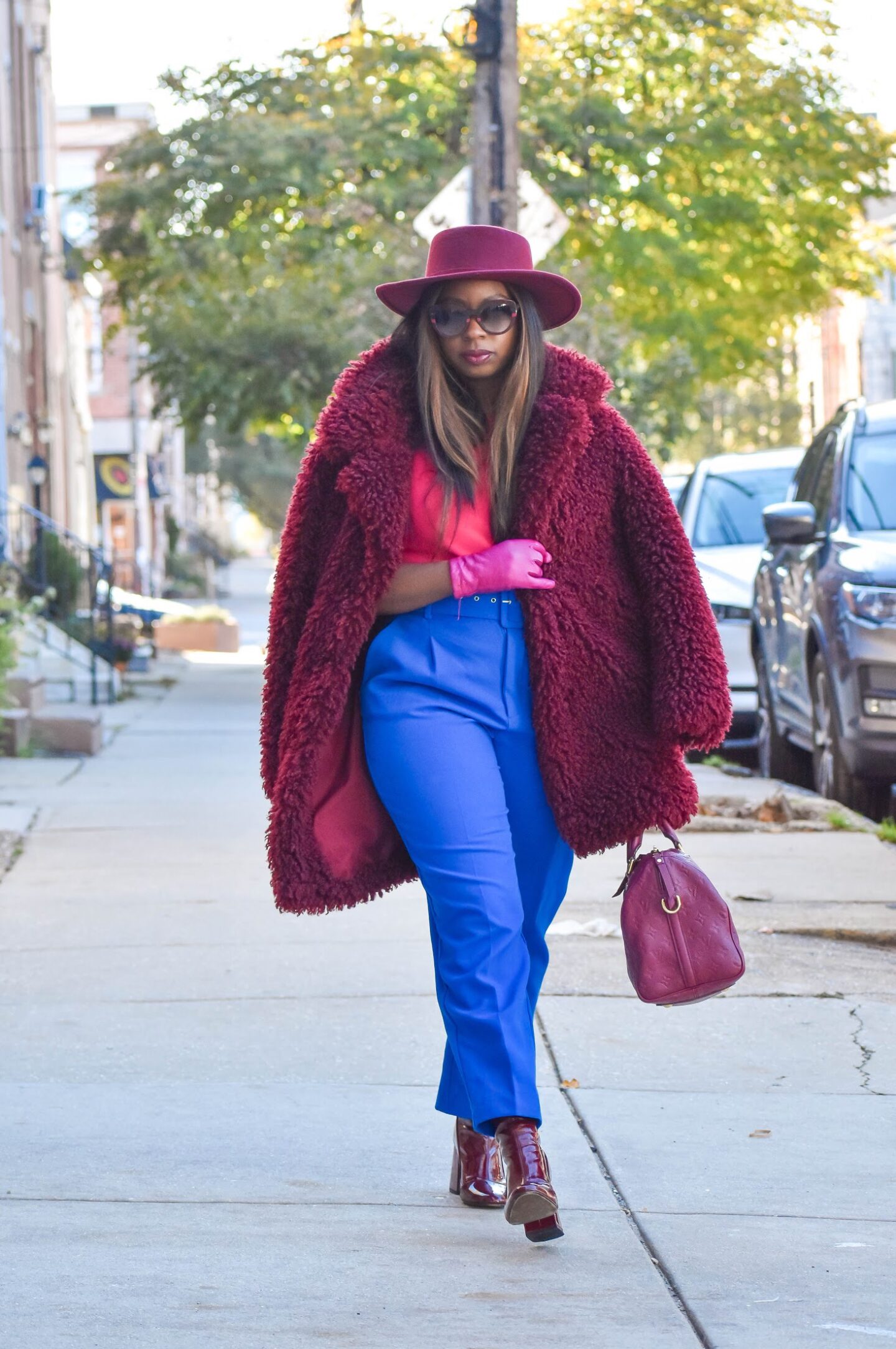
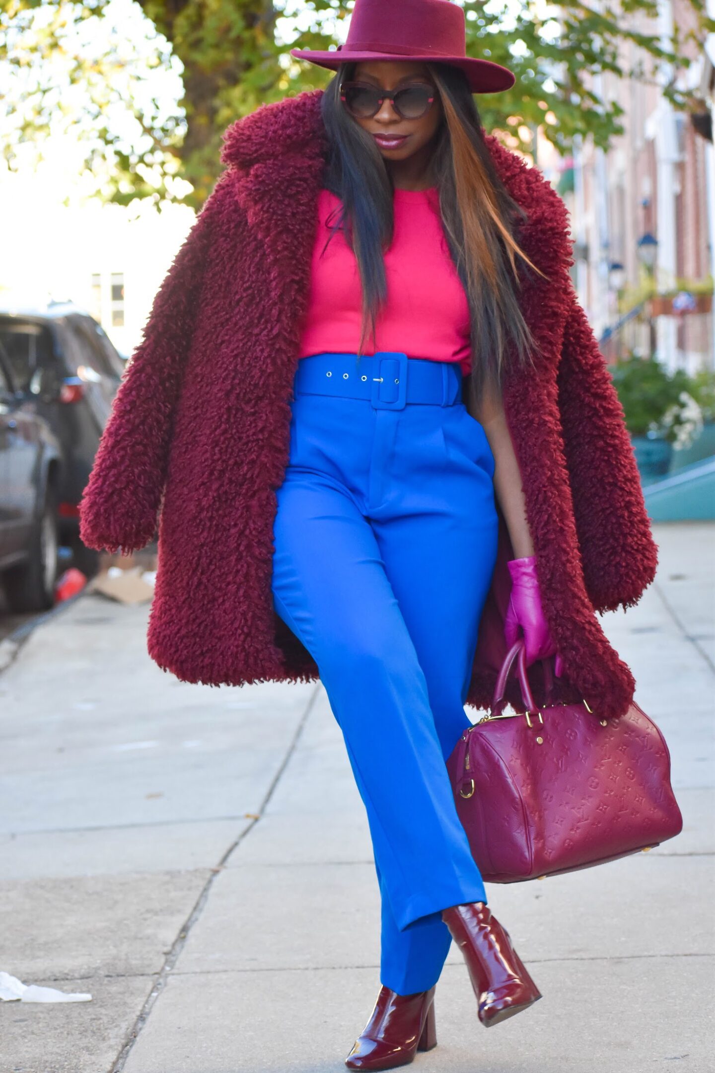
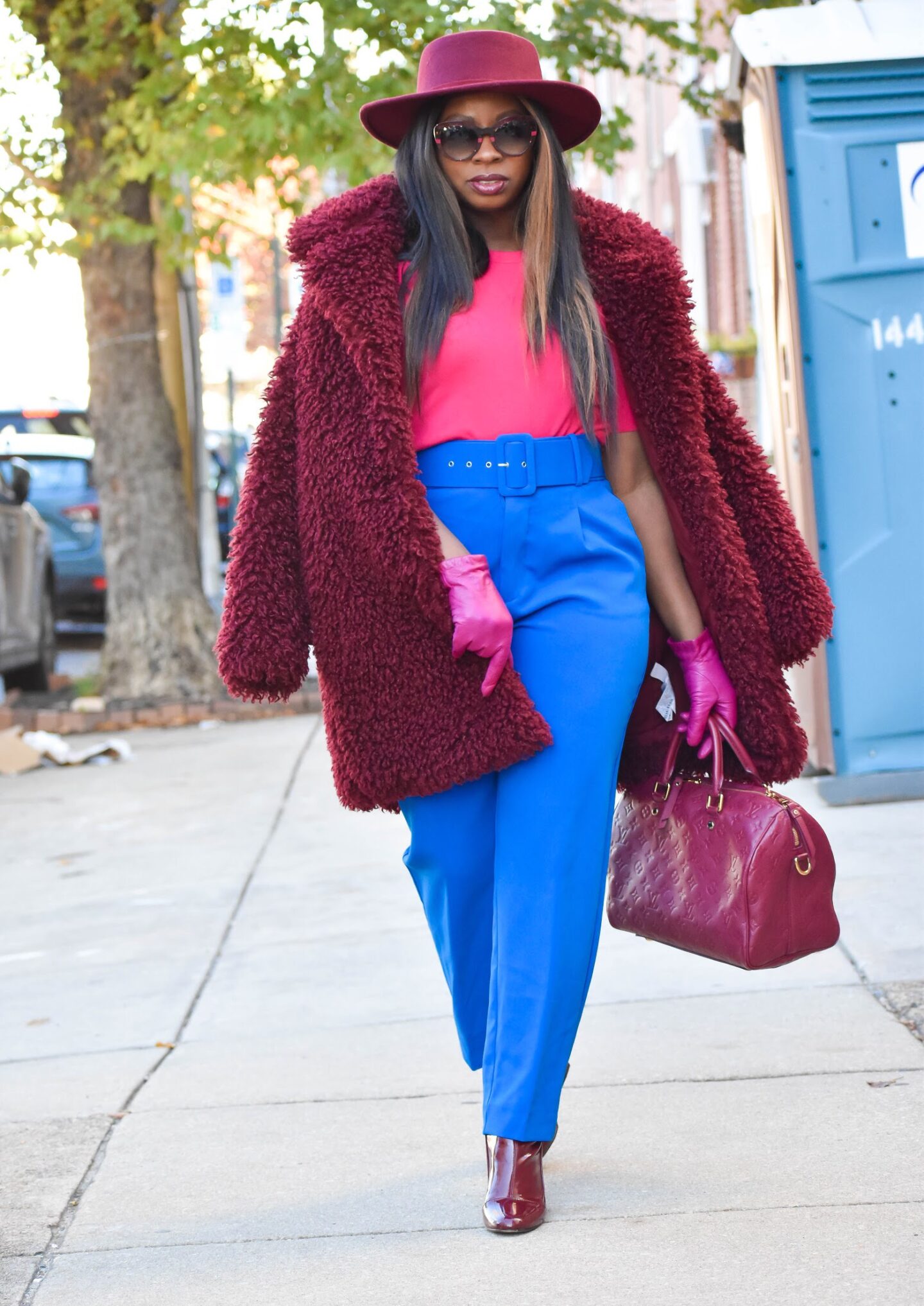
You guys know I’m no stranger to color, but I typically tend to manifest my love of color through various patterns. However, I have always been a fan of colorblocking. The runways and streets have shown more of a tone on tone approach lately in monochromatic colors; but colorblocking at its core has reared more to bright. It can be defined as the use of contrasting blocks or panels of solid, typically bright color. So I thought I’d get back to my roots with this berrylicious pink and blue combo. Read my tips below on how to colorblock like a pro.
Clean and Simple Lines:
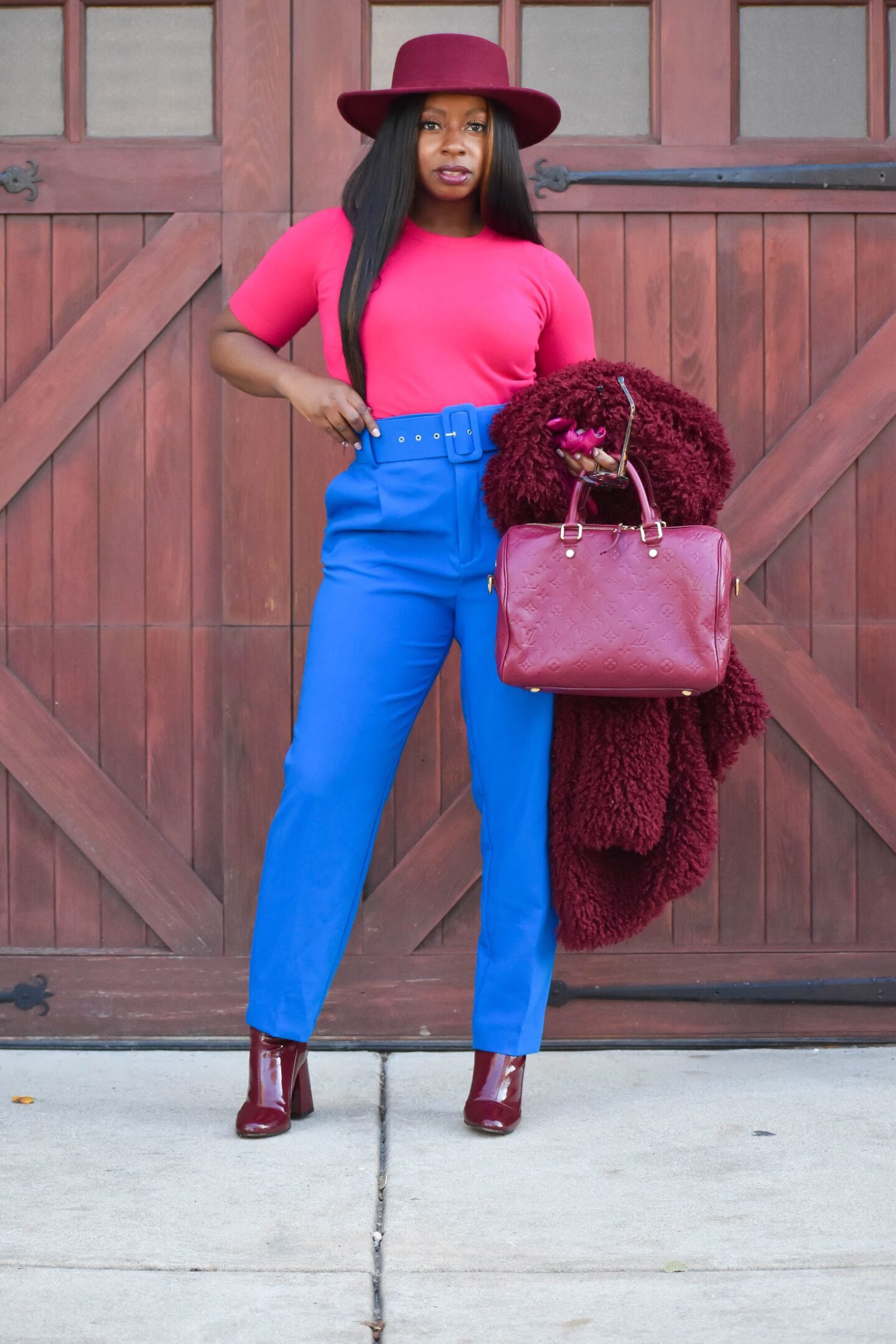
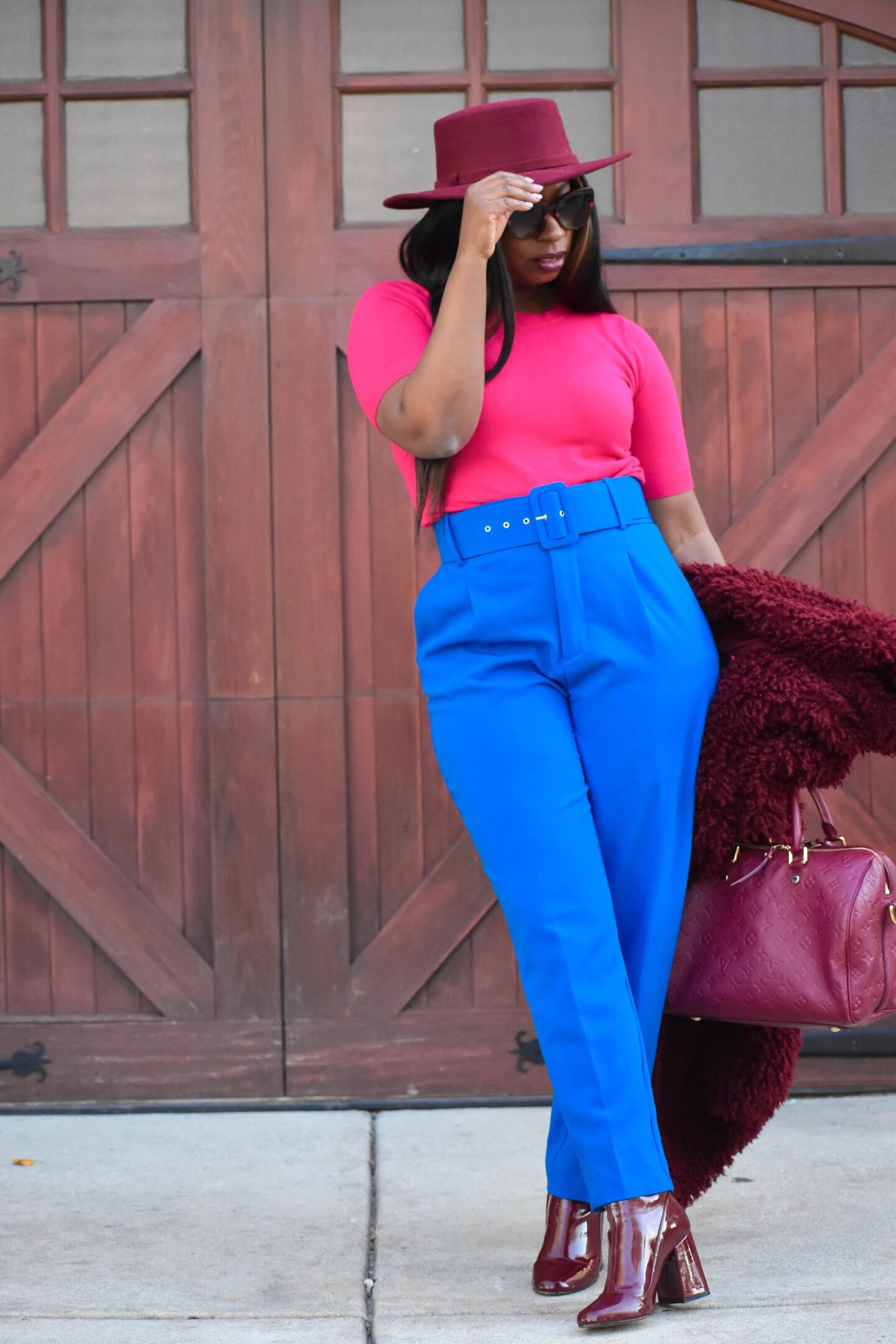
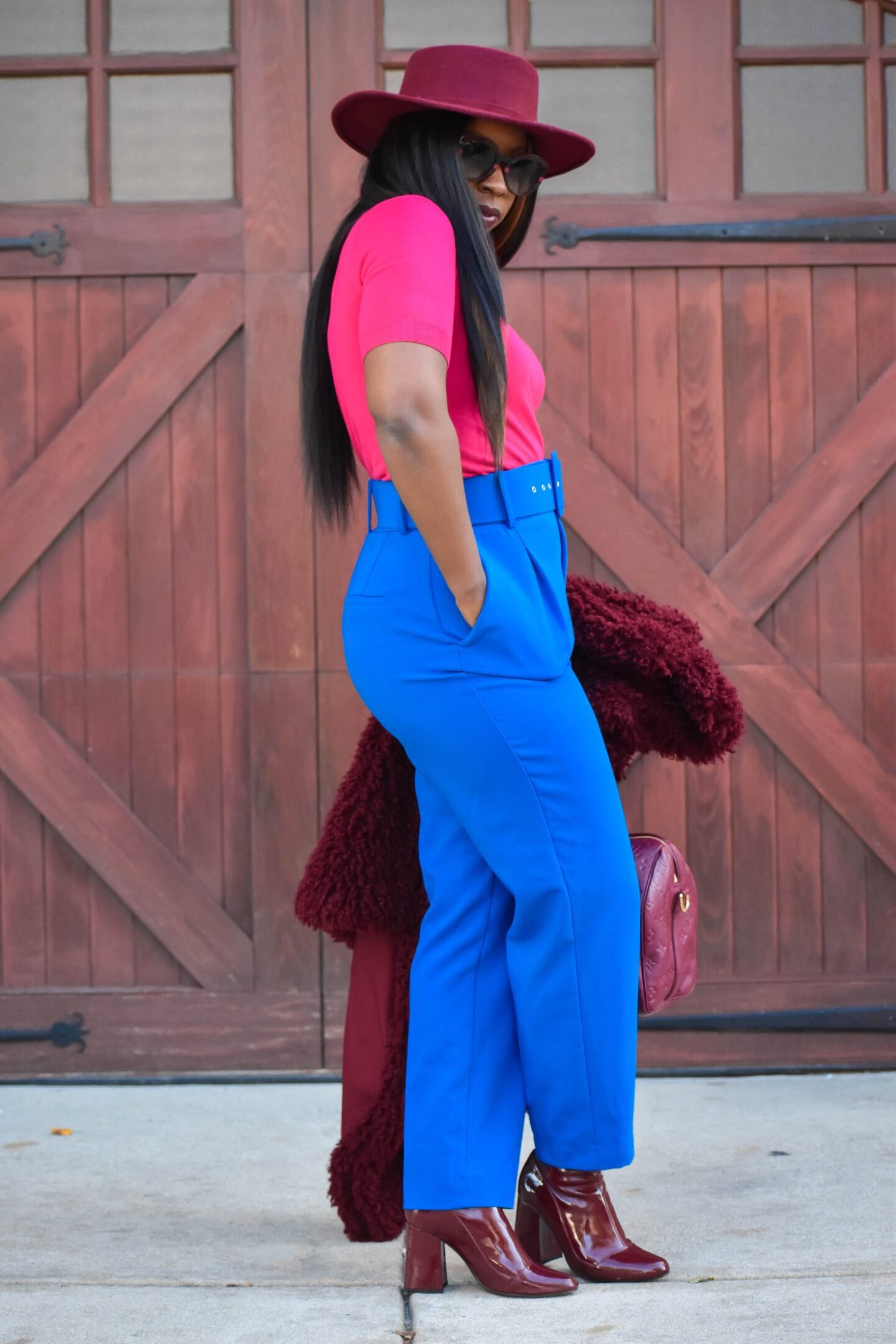
You ever hear the acronym KISS? It stands for Keep it Simple Stupid… and this is oh so true for this idea. Because the colors are speaking volumes there’s no need to add to the noise with overly complicated silhouettes. Your colorS should be the statement. When selecting pieces opt for clean, minimal styles. I chose a high waisted pant and paired with a fitted fuschia knit. The pant has some interest but neither piece overpowers the other. Pencils skirts, fitted turtlenecks (merino or cashmere) and satin slip skirt are also good options to select.
Add Interest with Texture:
If you’re like me, where more is more, you may feel a little bored by just the simplicity. The key to adding more interest to your outfit is with texture. Play with different fabrics when selecting your pieces, which will add pizzaz to your look. I added an extra fuzzy teddy coat in the same color family and matched my boot to keep from being to busy. My textile of choice for my boot was patent; the extra shine pulls everything together and gives my outfit that extra sparkle. I then topped it off with hot pink leather gloves, for a total of 3 additional textures to my base.
By simple changing out a textile in the same color instantly elevates your look. If you’re wearing leather, try pairing with a silk or feather top. Corduroy and cashmere are another match made in heaven. The casual look of corduroy mixed with the luxe loftiness of cashmere will boost your look to the next level. What fabrics do you like to mix together. Sound off in the comments below.
The Rule of 3:
When colorblocking, limit your introduction of different colors to no more than 3. Now this is just my rule, which such rule can be broken if done correctly. However, I just find that this keeps your look still polished and not overly busy. You also want to pick colors that are complimentary to each other. Selecting this way will ensure a failproof look every time. For example, red and green are complimentary as well as yellow and purple. Now this also includes varying tones of these colors. For instance, you could swap out traditional green for mint green; (paired with red) for a fun look. See my post on mixing colors for more combinations. Fellow blogger and one of my faves, Blaire Eadie is a master at this so be sure to check out her blog The Atlantic- Pacific for more inspo.
I hope these tips have prepped you to be a colorblock queen. This is always an interesting option when your neutral tones just aren’t cutting it and you want to spice things up a bit. Colorblocking allows for endless combinations, so start mixing it up.